- Data visualization & exploration with PCA
Nathan Brouwer | brouwern@gmail.com | @lowbrowR
2018-11-27
e-PCA_data_vis.RmdExploring data with PCA
This tutorial is optional, some what esoteric, and not well organized
- PCA is a very common “dimension reduction” tool
- It can take several correlated variables and extact a smaller number of uncorrelated, “latent” variables
- The math behind this is tricky, and the interpretation requires some practice
- Getting good at PCA let’s you explore the structure of complex datasets
- Using PCA, I found that Australian mammals are very distinct from all other species. This was alluded to in the original paper but did not factor into their analysis.
- We’ll briefly do 2 PCAs
- 1st on the reponse variables (y) from the milk dataset (% fat, % protein, etc) and
- 2nd on the predictor variables (body mass, duration of gestation etc)
- This is just a very very very brief intro to the R functions and key vocab. There are several good tutorials online with more info.
Load cleaned data
# install_github("brouwern/mammalsmilk")You can then load the package with library()
library(mammalsmilk)Load data cleaned in previous tutorial
data("milk")Packages
library(ggplot2)
library(cowplot)
##
## Attaching package: 'cowplot'## The following object is masked from 'package:ggplot2':
##
## ggsavelibrary(dplyr)##
## Attaching package: 'dplyr'## The following objects are masked from 'package:stats':
##
## filter, lag## The following objects are masked from 'package:base':
##
## intersect, setdiff, setequal, unionTransformations
Because the variables are on very different scales it helps to transform them
The old-school way of doingthis might be to do it column by column
milk$gest.mo.log <- log10(milk$gest.month)
milk$repro.log <- log10(milk$repro.output)
milk$mass.litter.log <- log10(milk$mass.litter)
milk$lact.mo.log <- log10(milk$lacat.mo)
milk$mass.fem.log <- log10(milk$mass.fem)
In dplyr you can use the mutate() function from dplyr
milk <- milk %>% mutate(gest.mo.log = log(gest.month),
                repro.log = log(repro.output),
                mass.litter.log = log(mass.litter),
                lact.mo.log = log(lacat.mo),
                mass.fem.log = log(mass.fem))
Pairs plot
- Look for correlations among variables.
- Many of the predictors are highly correlated.
- Such collinearity among variables makes it difficult to build models w/multiple predictors
- Instead you can only use one predictor at a time
- These plots also indicate at curious cloud of points that typically occurs below the main point mass.
pairs(milk[,c("gest.mo.log",
          "repro.log",
    "mass.litter.log",
    "lact.mo.log",
    "mass.fem.log")],
    lower.panel = NULL)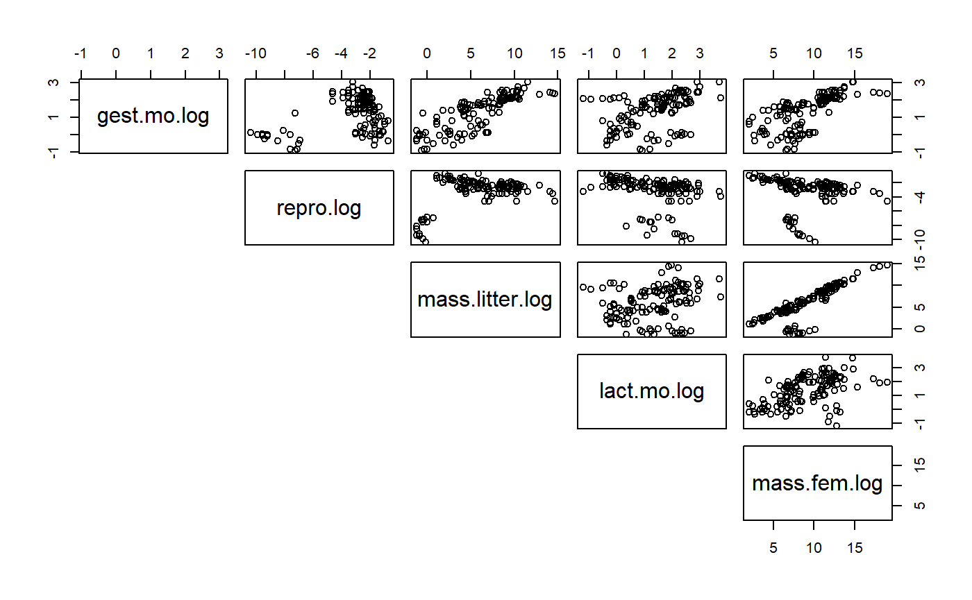
Similar functionality can be done in ggplot using GGally::ggpairs()
PCA on predictor (x) variables
- Many of the predictors aer highly correlated
- The predictors result in a PCA that is a bit easier to interpret
PCA on predictory variables
Run the PCA with princomp()
#principal compoents
pca.x.vars <- princomp(~  gest.mo.log+
                         repro.log+
    mass.litter.log+
    lact.mo.log+
    mass.fem.log,
  data = milk)
Biplot
A biplot takes some time to learn how to read, a skill that is beyond this tutorial. It is easy to see unique underlying structures pop out in biplots. The group of points away from the main band will be shown below to be Australian mammals (marsupials etc)
biplot(pca.x.vars)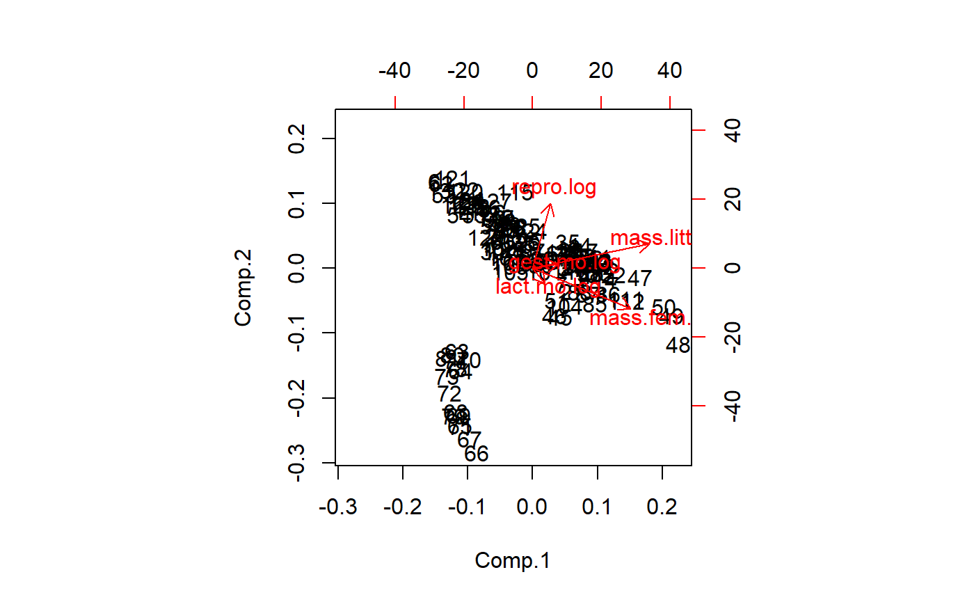
Plot w/o point by setting first color to 0
biplot(pca.x.vars,col = c(0,2))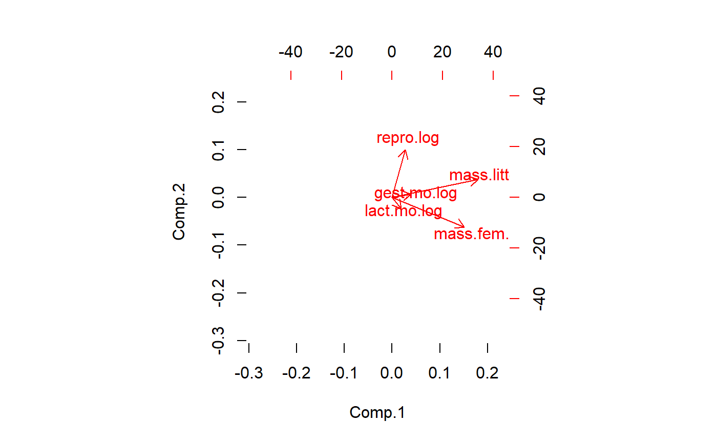
The biplot tells us that a major axis of variation is female mass and lactation duration. These two variables are highly correlated. A 2nd major axis of variation is reproductive output, which is at a right angle to female mass/lactation. This implies that after accounting for female mass, there is additional, independent variation in the data due to reproduction. Litter size and gestation duration are at about a 45 degree angle between female maass reproduction. This implies another dimension of variation that is partially correlated with both of the other two.
PCA generates as many latent variables as there are original variables. Usually only the first few are useful. This codes displays the 2nd vs. the 3rd PCs
biplot(pca.x.vars,
       choices = c(2,3),
       col = c(0,2))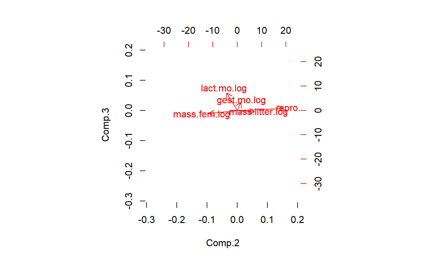
What a biplot is plotting are “PCA” scores. We can plot these by hand by extracting them from the list embedded in the PCA output object. I’ll use qplot() from ggplot to plot this
qplot(y = pca.x.vars$scores[ ,"Comp.2"] ,
      x = pca.x.vars$scores[ ,"Comp.1"] )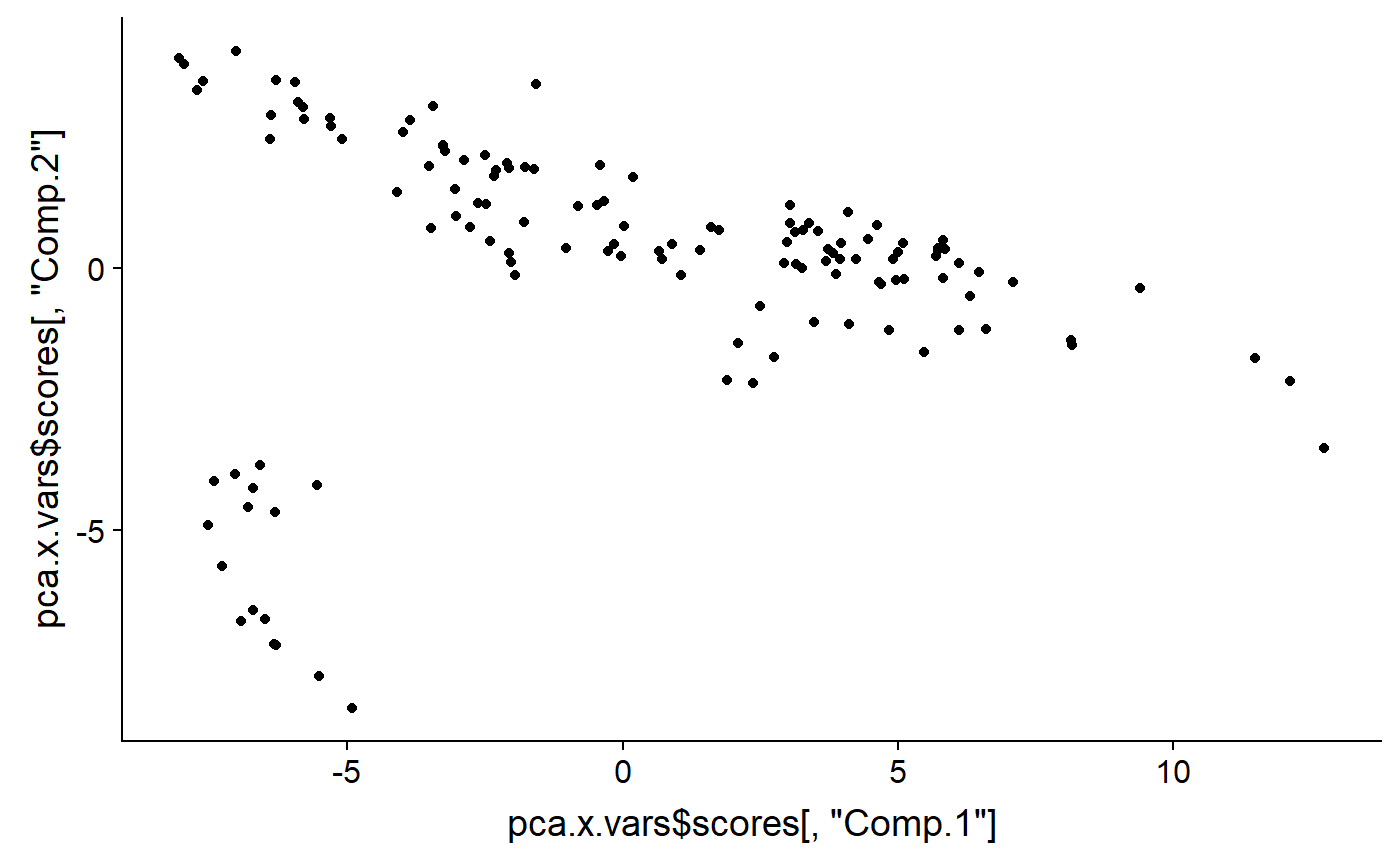
And add color code them to identify groups. It looks like that outlying group are Monotremata. Diprotodontia (marsupials), and Didelphimorphia (opossum).
qplot(y = pca.x.vars$scores[ ,"Comp.2"] ,
      x = pca.x.vars$scores[ ,"Comp.1"] ,
      color = milk$ord)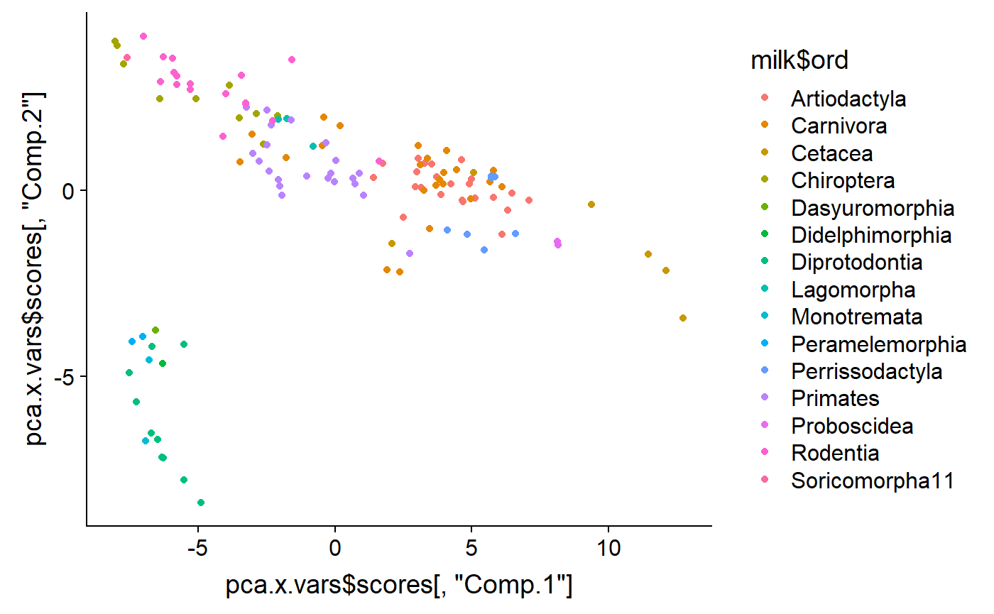
I can add labels to confirm
labs <- gsub("ontia","",milk$ord)
labs <- gsub("ata","",milk$ord)

qplot(y = pca.x.vars$scores[ ,"Comp.2"] ,
      x = pca.x.vars$scores[ ,"Comp.1"] ,
      color = milk$ord) +
  annotate(geom = "text",
           y = pca.x.vars$scores[ ,"Comp.2"] ,
      x = pca.x.vars$scores[ ,"Comp.1"] ,
           label = labs)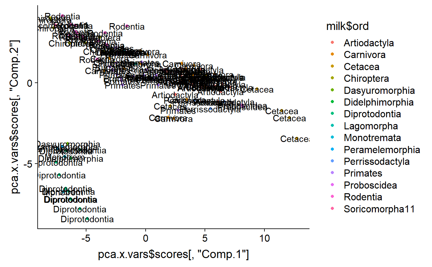
Make new variable for outliers
i.weirdos <- which(milk$ord %in% c("Monotremata"  #monotremes
,"Diprotodontia"  #marsupials
,"Didelphimorphia"#opossums
,"Dasyuromorphia"#tasmanian devil)
,"Peramelemorphia" #bandicoots
))

milk$Australia <- "other"

milk$Australia[i.weirdos] <- "Australia"

qplot(y = pca.x.vars$scores[ ,"Comp.2"] ,
      x = pca.x.vars$scores[ ,"Comp.1"] ,
color = milk$Australia) 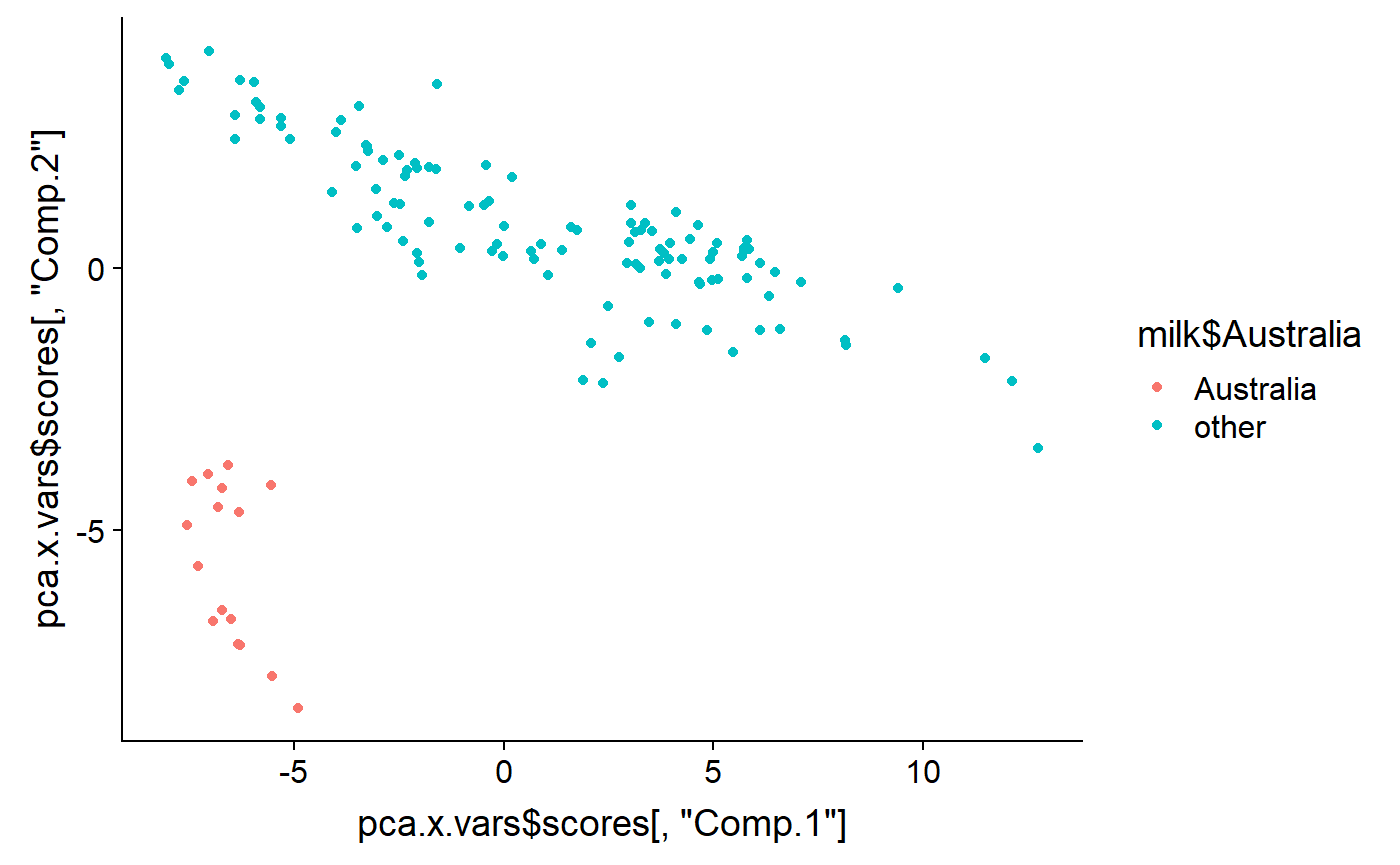
As noted above, PCA generates as many latent variables as there are original variables. Usually only the first few are useful. This codes displays the 2nd vs. the 3rd PCs
qplot(y = pca.x.vars$scores[ ,"Comp.3"] ,
      x = pca.x.vars$scores[ ,"Comp.2"] ,
color = milk$Australia) 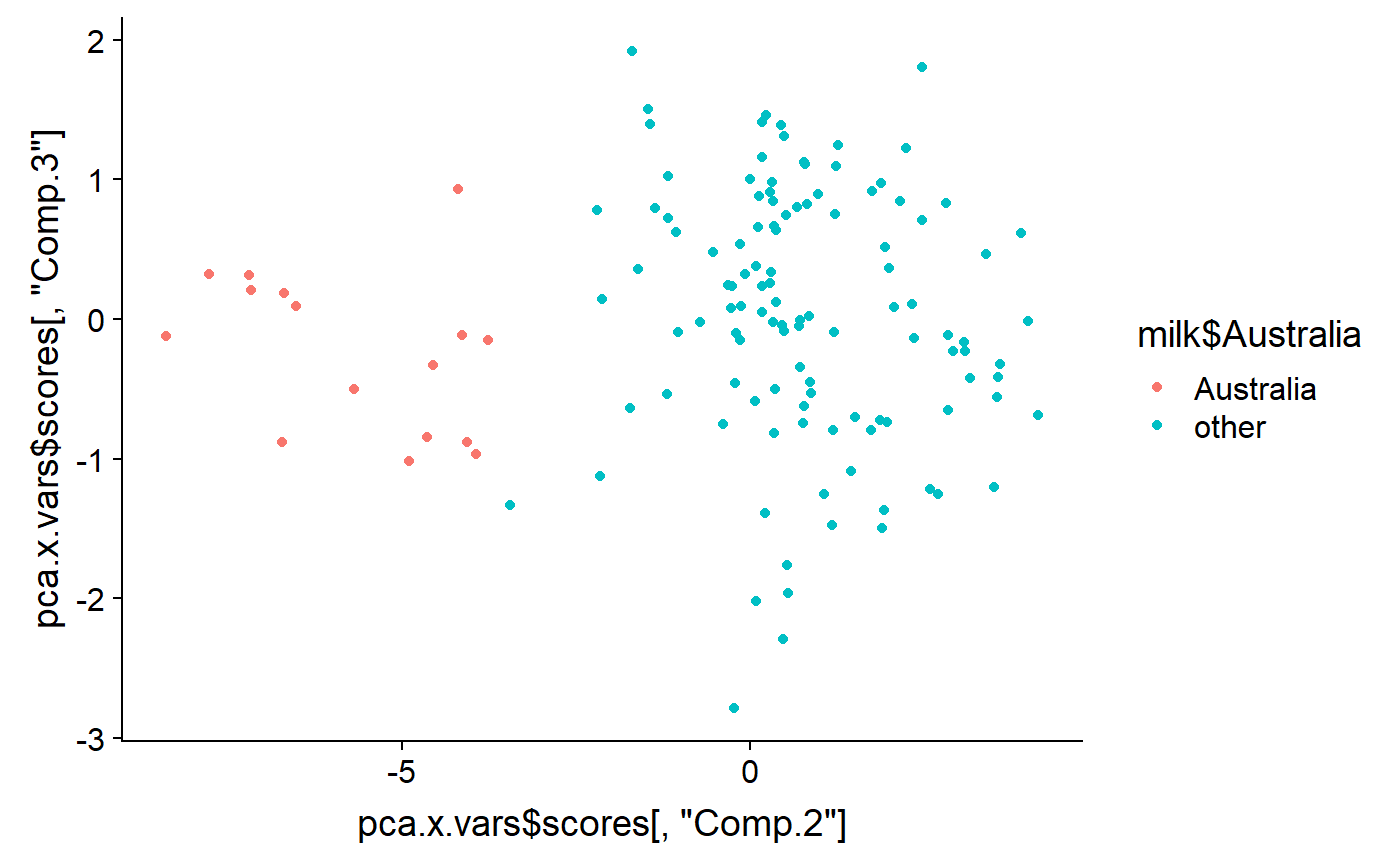
And the 1st vs. the 3rd
qplot(y = pca.x.vars$scores[ ,"Comp.3"] ,
      x = pca.x.vars$scores[ ,"Comp.1"] ,
color = milk$Australia) 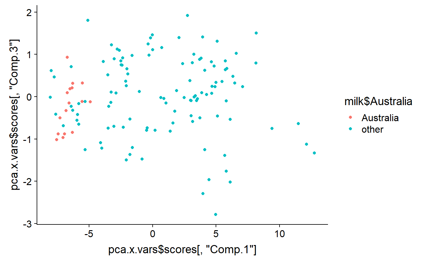
PCA with response variables
This turns out to be an ugly biplot but I’ll do it anyway.
For each mammal species the authors found data on 5 different aspects of their milk
- fat %
- protein %
- sugar %
- energy
- dry.matter #removed somewhere - need to add back
These things are frequently correlated. We can see this in a “pairs” plot
pairs(milk[,c("fat","prot",
            "sugar","energy")],
      lower.panel = NULL)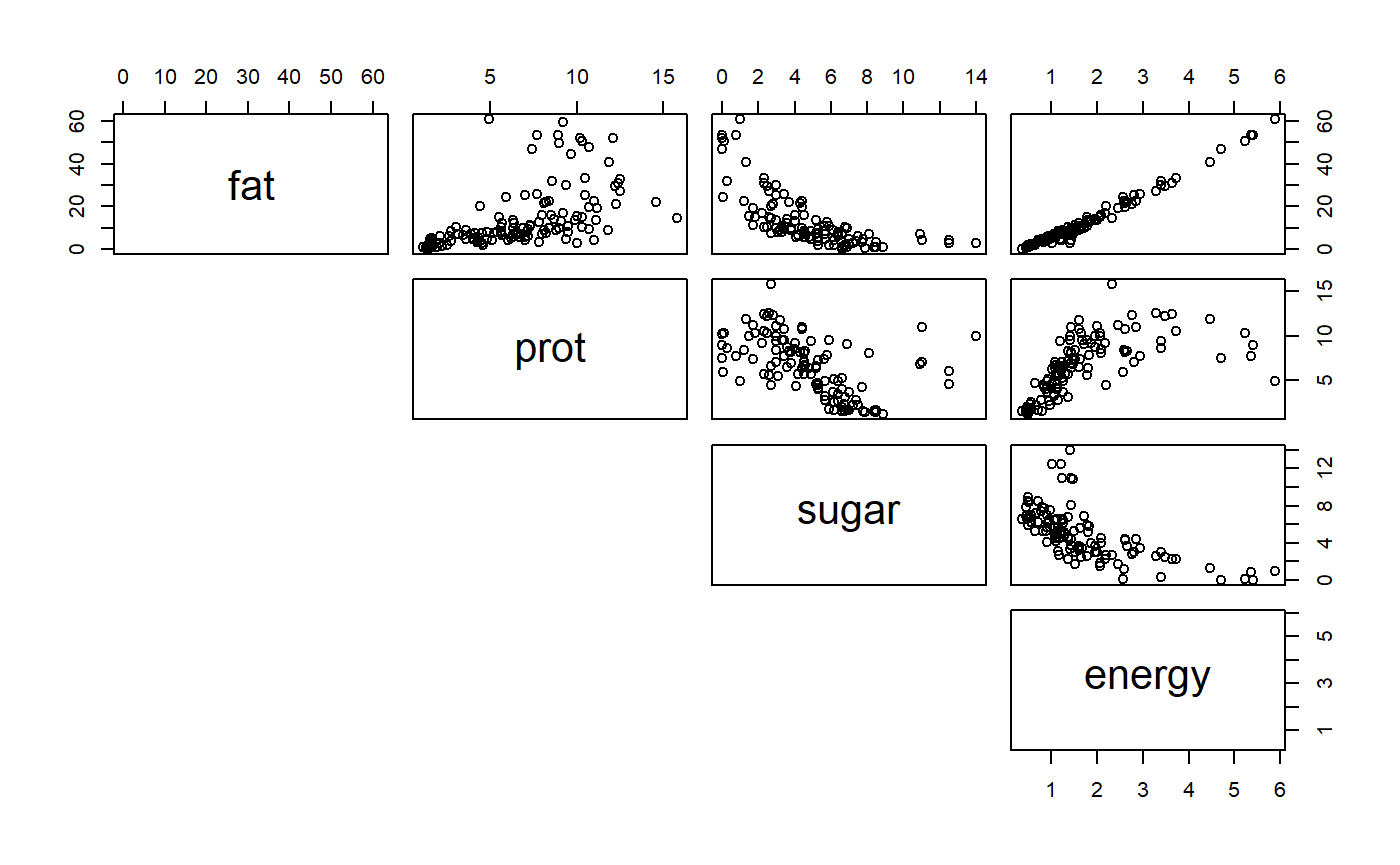
You can see that the percentage data (fat, protein, sugar) are negatively correlated b/c if a high fat percent must have a low fat percent, etc. These different columns of data therefore do not have independent information. PCA allows us to combine them to look for overal axes of variation.
Run a PCA
- There are 2 base R functions for PCA
- princomp
- prcomp
- There are important differences; I forget what they are
milk.noNA <- na.omit(milk)
pca.y.vars <- princomp(~ fat + prot +
                         sugar + energy ,
                       data = milk.noNA)
Make biplot of response variables
- biplots allow you to visualize axes of variation
- These response variables is not a particularly great dataset for this because the %s are all so highly correlated.
biplot(pca.y.vars,
       cex = 0.9,
       main = "Milk y vars")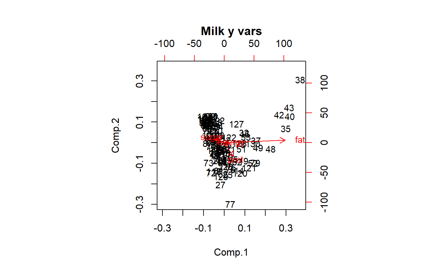
Make into dataframe
df <- data.frame(Comp.3 = pca.y.vars$scores[ ,"Comp.3"] ,
                 Comp.2 = pca.y.vars$scores[ ,"Comp.2"] ,
                 Comp.1 = pca.y.vars$scores[ ,"Comp.1"],
                 milk.noNA)
Are the outliers Australian?
qplot(y = Comp.2 ,
      x = Comp.1,
      color = Australia,
      data = df)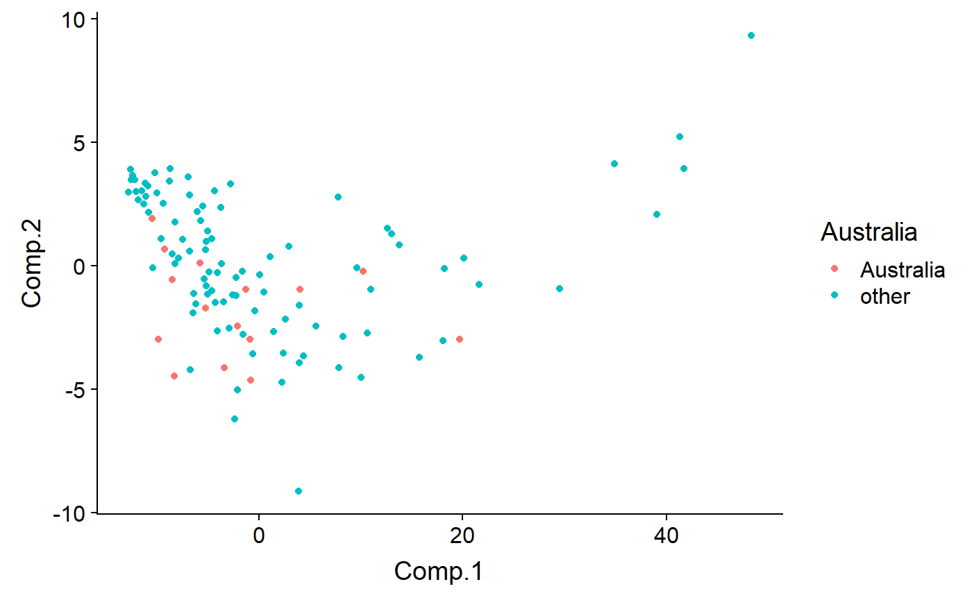
Code by biome - outliers are Aqutic
qplot(y = Comp.2 ,
      x = Comp.1,
      color = biome,
data = df) 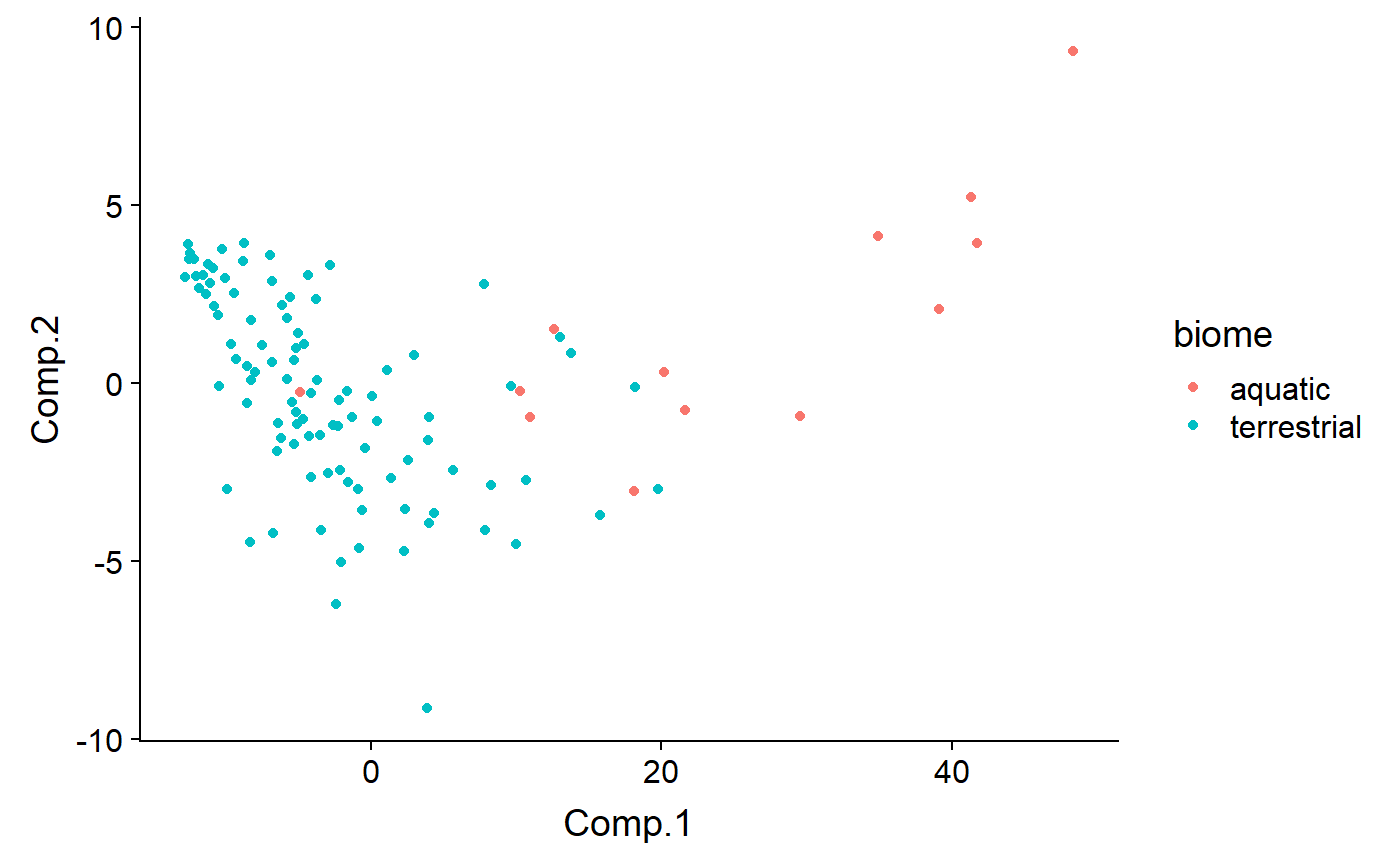
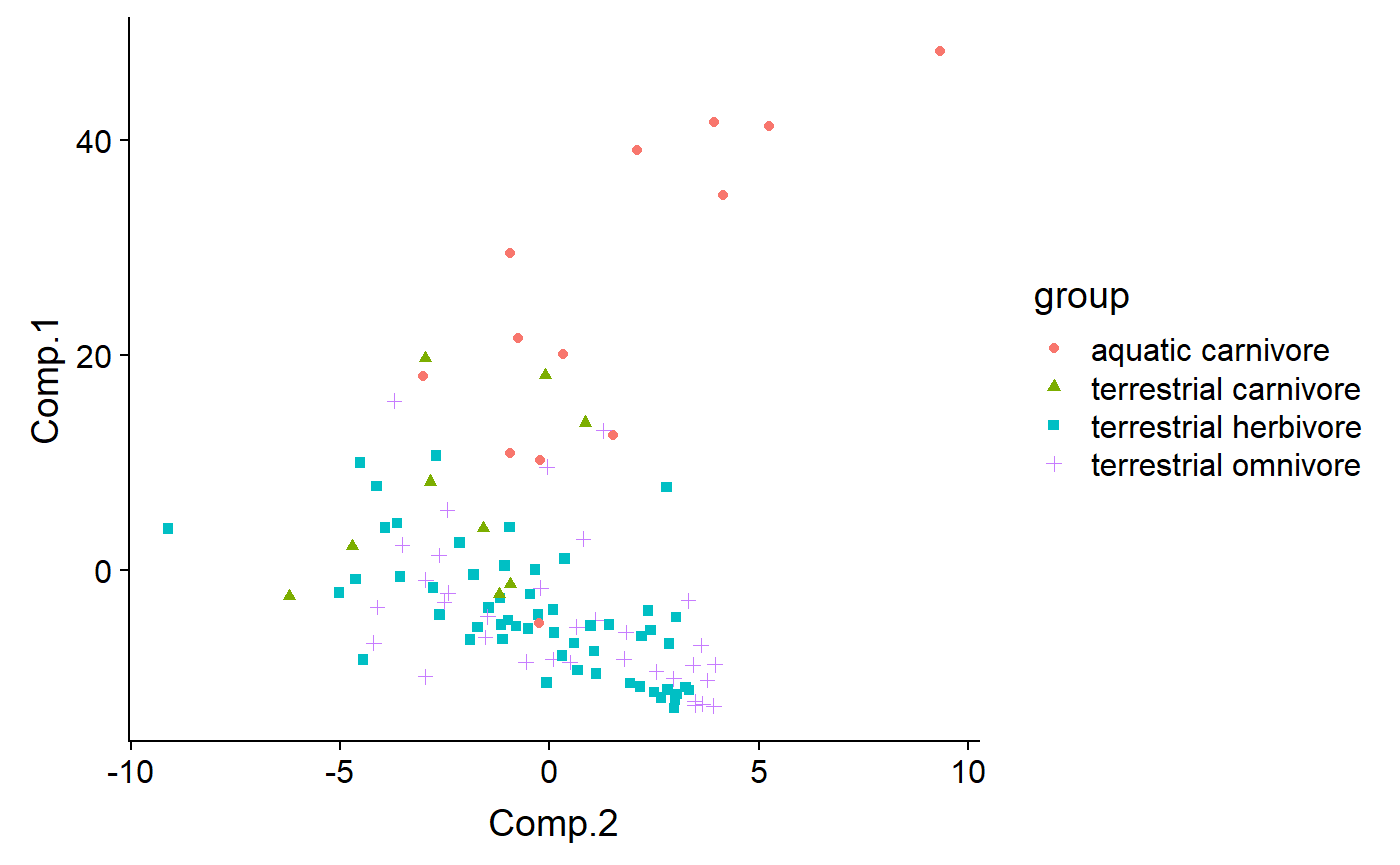
Code by biome and diet - most (all?) aquatic organismsin the dataset are also carnivores, because most aquatic mammals are carnivores (exceptions? Manatees and …)
qplot(y = Comp.2 ,
      x = Comp.1,
      color = biome,
      shape = diet,
data = df) 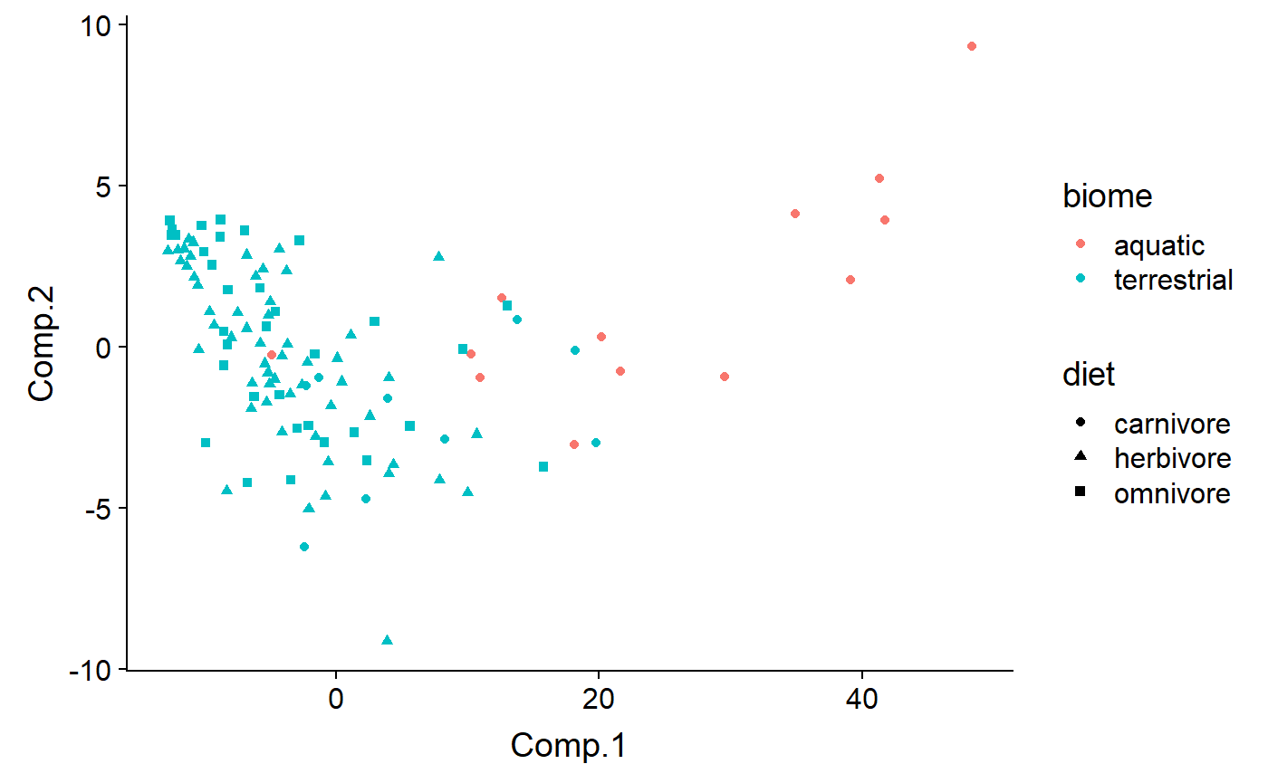
Facet by diet
qplot(y = Comp.1 ,
      x = Comp.2,
      color = biome,
      shape = diet,
      #size = log(mass.fem),
      data = df,
facets = diet ~ .) 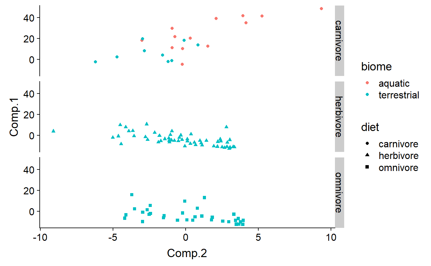
df$group <- with(df, paste(biome,diet))

qplot(y = Comp.1 ,
      x = Comp.2,
      color = group,
      shape = group,
      #size = sqrt(lacat.mo),
      data = df)