Chapter 9 Plotting data in dataframes
library(Stat2Data)
data(SeaIce)
Most data in R are organized into dataframes. Similar to when we plot data in a spreadsheet, to plot data from a dataframe we need to tell R exactly what we want on the x-axis (horizontal) and y-axis (vertical).
⚠️ Note: For reasons we don’t have to get in to, the lynx data were a special case where we didn’t have to define x and y⚠️
We can plot the Extent of artic sea ice again using the plot() command, and using a cool convention in R called formula notation. Formula notation uses the (tilde)[https://en.wikipedia.org/wiki/Tilde] symbol ~. In math, ~ can have several meanings. In R, it means “relates to” , “versus”, “depends on.” So we can plot the relation between Year and seac Extent as a y versus x relation as Extent ~ Year. We also have to include the argument data = SeaIce so R knows where to get Extent and Year.
plot(Extent ~ Year, data = SeaIce) # Note, both words capitalized.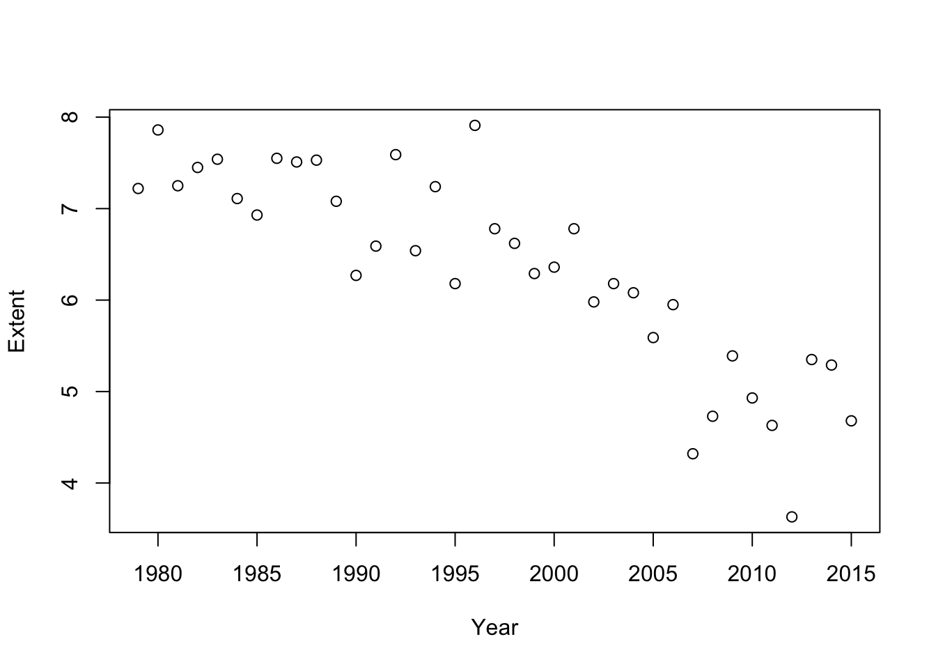
9.1 Base-R graphics
When we use the plot command were using Base R graphics. As noted before there are several ways to make plots in R and you should be able to spot which one is which when looking at code. We’ll cover some of the key features of Bare R graphics now. While different plotting methods have different commands and arguments, they all share a common feature: everything in a plot can be customized, and each element is customized with a command or arguement.
9.1.1 Type of points
plot() can draw dots or lines We make it use lines using the type = "l" argument (note that the l is in quotes)
plot(Extent ~ Year, type = "l", data = SeaIce) # Note: l in quotes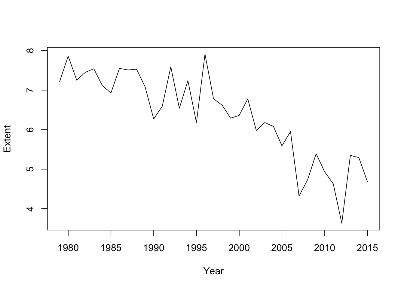
As noted before, R doesn’t mind if you split things on lines. To keep track of the things I”m doing to the plot I’ll format things like this
plot(Extent ~ Year,  # relationship
     type = "l",     # type of plot; Note: l in quotes
     data = SeaIce)  # data
As we did with the lynx data we can combine points and lines with type = "b". (Do you recall what “b” stands for?)
plot(Extent ~ Year,  # relationship
     type = "b",     # type of plot; Note: b in quotes
     data = SeaIce)  # data
We can adjust color with col = .... Recall the this is just a number, not in quotes.
plot(Extent ~ Year,  # relationship
     type = "b",     # type of plot; Note: b in quotes
     col = 2,        # color; no quotes
     data = SeaIce)  # data
We can add a main title to with main = ...
plot(Extent ~ Year,  # relationship
     type = "b",     # type of plot; Note: b in quotes
     col = 2,        # color; no quotes
     main = "Arctic Sea Ice Extent", # main title, in quotes
     data = SeaIce)  # data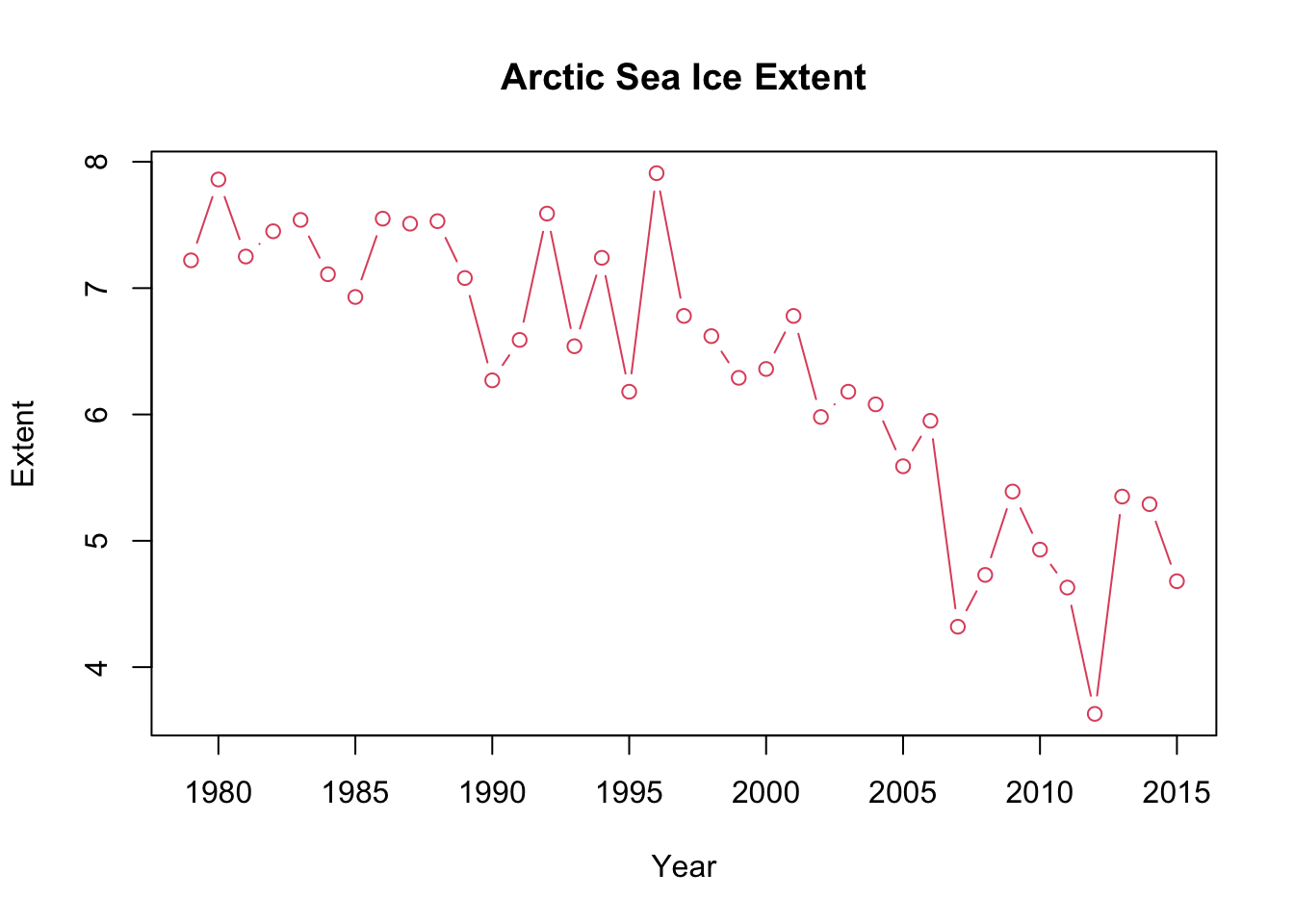
Its always good to include your units. Extent and Area are in square kilometers. We can say specifically what we want for the y-axis label using ylab = ...
plot(Extent ~ Year,  # relationship
     type = "b",     # type of plot; Note: b in quotes
     col = 2,        # color; no quotes
     main = "Arctic Sea Ice Extent", # main title, in quotes
     ylab = "Extent (square kilometers)",
     data = SeaIce)  # data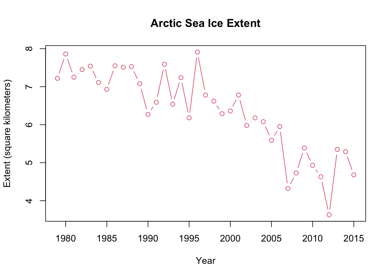
We can change the appearance of the line using lty = ..., which stands for “line type”:
plot(Extent ~ Year,  # relationship
     type = "b",     # type of plot; Note: b in quotes
     col = 2,        # color; no quotes
     main = "Arctic Sea Ice Extent", # main title, in quotes
     ylab = "Extent (square kilometers)",
     lty = 2,        # line type; not quoted
     data = SeaIce)  # data
I’m not a fan of the open circles for plotting points; we can change those too using the argument pch =.
plot(Extent ~ Year,  # relationship
     type = "b",     # type of plot; Note: b in quotes
     col = 2,        # color; no quotes
     main = "Arctic Sea Ice Extent", # main title, in quotes
     ylab = "Extent (square kilometers)",
     lty = 2,        # line type; not quoted
     pch = 16,       # point type; not quoted
     data = SeaIce)  # data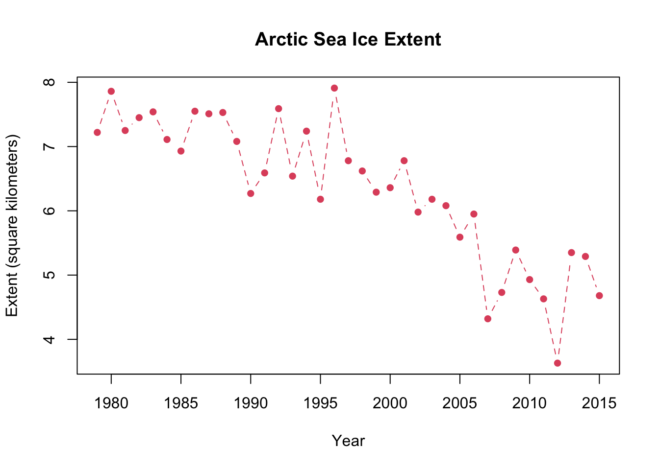
9.1.2 Plotting two columns of data
Often we want to represent two distinct things on our graph. In spreadsheets these are called separate series of data. When making a time series plot like this one we can add a new column of data using a species command called points() which works very similar to plot().
⚠️ Note: The points() command only works if its it precede by a statement from the plot() command ⚠️
# Main plot: Extent
plot(Extent ~ Year,  # relationship
     type = "b",     # type of plot; Note: b in quotes
     col = 2,        # color; no quotes
     main = "Arctic Sea Ice Extent", # main title, in quotes
     ylab = "Extent (square kilometers)",
     lty = 2,        # line type; not quoted
     pch = 16,       # point type; not quoted
     data = SeaIce)  # data

# Second column of data: Area
points(Area ~ Year, data = SeaIce)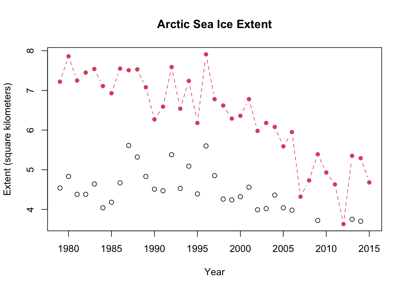
I can now customize the sea ice Area part of the plot by add arguments to the points() statement.
# Main plot: Extent
plot(Extent ~ Year,  # relationship
     type = "b",     # type of plot; Note: b in quotes
     col = 2,        # color; no quotes
     main = "Arctic Sea Ice Extent", # main title, in quotes
     ylab = "Extent (square kilometers)",
     lty = 2,        # line type; not quoted
     pch = 16,       # point type; not quoted
     data = SeaIce)  # data

# Second column of data: Area
points(Area ~ Year,
       type = "b",
       col = 3,
       pch = 17,
       data = SeaIce)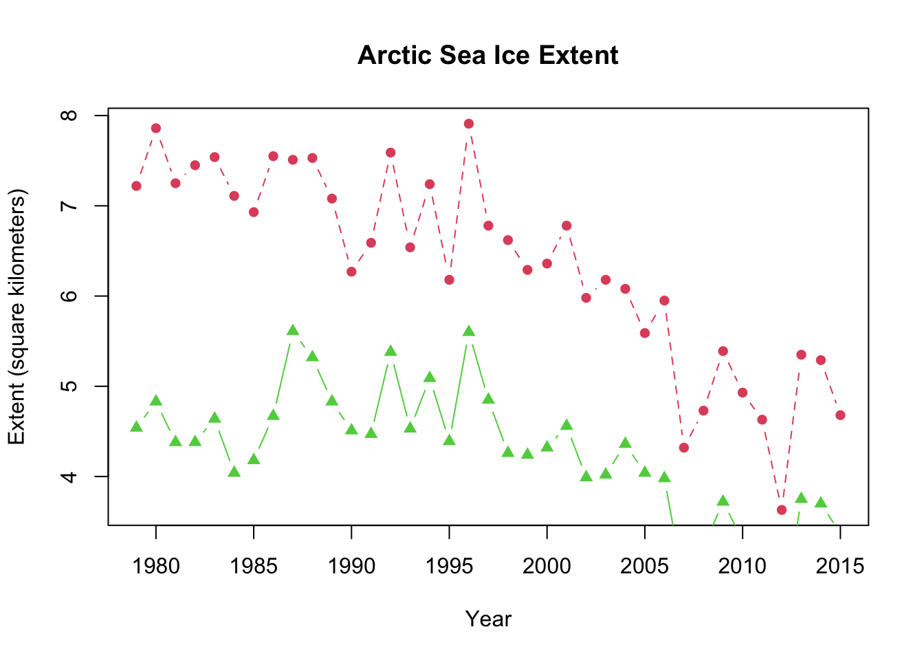
❓ There’s a problem with my graph though - can you spot it? It only really becomes apparent when you connect the dots with a line. ❓
9.1.3 Changing the range of a plot axis
Let’s go back to our original plot and forget about all the fancy arguments and adding points() for a little bit. The problem with the last graph we made is that some points are not showing - if you look in the lower right-hand part points around 2006-2008 and 2011-2013 are not showing up because the y-axis stops around 3.5. We can fix this by adding a new argument which sets the limits of the y-axis: ylim = .... To do this correctly, we have to introduce a new function: c(). This is actually one of the most common functions in R. In the c() we need to tell R the lower and upper limits we want for the y-axis. Let’s do 0 and 8, which will be coded as c(0,8).
So, to set the y-axis limits we do this:
plot(Extent ~ Year,
     ylim = c(0,8), # the c(...) fucntion to set limits
data = SeaIce) 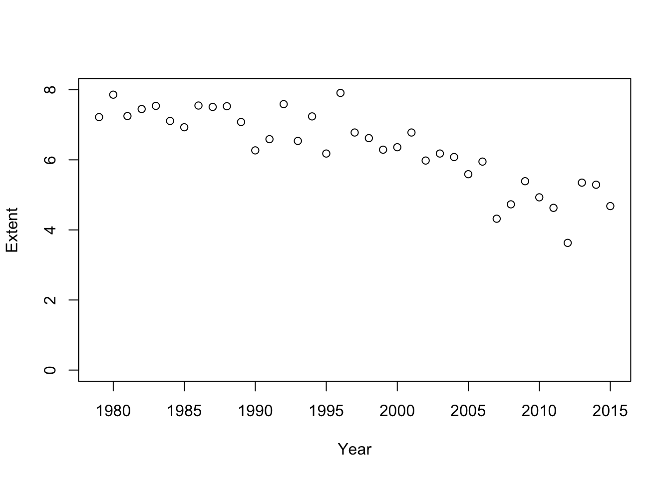
Now we have a bunch more space at the bottom. We can add our points() back to see if this work:
plot(Extent ~ Year,
     ylim = c(0,8), # the c(...) fucntion to set limits
     data = SeaIce)
points(Area ~ Year,
      data = SeaIce,
      col = 2)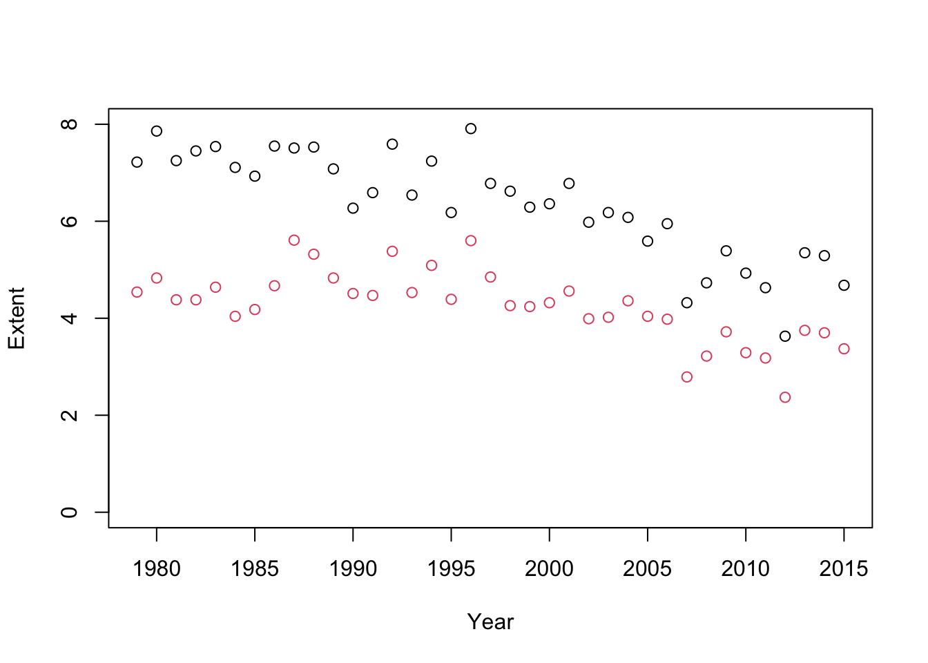
⚠️ Note: ylim = ... only goes in plot(), not points(). View() ⚠️
Let’s re-make our fancy plots now with ylim = ... set.
# Main plot: Extent
plot(Extent ~ Year,
     type = "b",
     col = 2,
     main = "Arctic Sea Ice Extent",
     ylab = "Extent (square kilometers)",
     lty = 2,
     pch = 16,
     ylim = c(0,8), # <#<== y-axis limits
     data = SeaIce)

# Second column of data: Area
points(Area ~ Year,
       type = "b",
       col = 3,
       pch = 17,
       data = SeaIce)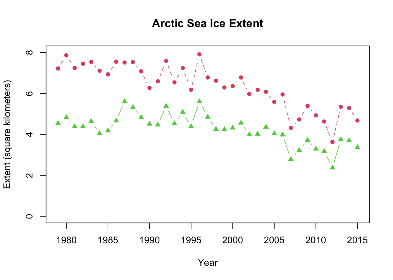
9.2 You try it
9.2.1 Fixer-uppers
Fix the code below so it works
plot(Extent , Year,
     data = SeaIce)
Fix the code below so it works
plot(Extent ~ Year,  # relationship
     type = b,     # type of plot; Note: b in quotes
     col = "2",        # color; no quotes
     data = SeaIce)  # data
9.2.2 Intermediate
Make a plot with Area on the x-axis and Extent on the y-axis.
## Write the code below9.2.3 Advanced
Based on the code above, make a plot of the SeaIce data where Area appears within the plot() statement, and Extent is in points().
# Write the code below: