Chapter 19 Data analysis encounter: T-test
19.0.1 Preliminaries
19.0.1.1 Load packages
library(wildlifeR)
library(ggplot2)
library(cowplot)
library(ggpubr)
library(dplyr)
19.0.1.2 Load data
data(frogarms)19.0.1.3 Subset your data
The function make_my_data2L() will extract out a random subset of the data. Change “my.code” to your school email address, minus the “(???)” or whatever your affiliation is.
my.frogs <- make_my_data2L(dat = frogarms,
                           my.code = "nlb24", # <=  change this!
                           cat.var = "sex",
                           n.sample = 20,
                           with.rep = FALSE)
t-test used to tell if 2 groups are different
19.0.2 T-test
Use the t.test() function. The reponse variable (aka the y variable) is mass and goes to the left of the ~. The predictor variable (x-variable) goes on teh right. The arguement data = … is used to tell the function where the response and predictor columns are found.
This spits out R’s standard t.test table
Save to object
mass.t <- t.test(mass ~ sex, data = my.frogs)19.0.3 Optional: cleaning up output with broom() [O]
This section is optional
look at w/broom::glance. re-labels things a bit odd and would be nice to round. will stick with original R output
library(broom)
glance(mass.t)
End optional section
mass.tCheck the means using dplyr
my.frogs %>% group_by(sex) %>% summarize(mean.mass = mean(mass))What does all of this mean?
Quiz
p = p interpretation = df = why df fractional? (this one is hard!) t = What would happen to p if t was bigger? What is a “95% CI” What is this a 95% CI for?
What does the CI mean?
plot_t_test_ES(mass.t)
Make a plot of the means with error bars. Save to an object called gg.means
gg.means <-ggerrorplot(data = my.frogs,
          y = "mass",
          x = "sex",
          desc_stat = "mean_ci") +
  ggtitle("Group means & error bars")
Save effect size
gg.ES <-plot_t_test_ES(mass.t) +
  ggtitle("__________ & errorbars")
Plot both
plot_grid(gg.means,gg.ES)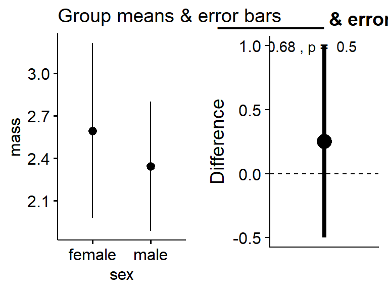
A hint
gg.means <-ggerrorplot(data = my.frogs,
          y = "mass",
          x = "sex",
          desc_stat = "mean_ci") +
  ylab("Mass (g)") +
  xlab("Sex") +
  ggtitle("Group means & error bars")


gg.ES <-plot_t_test_ES(mass.t) +
  ylab("Difference between groups (g)") +
ggtitle("__________ & errorbars")plot_grid(gg.means,gg.ES)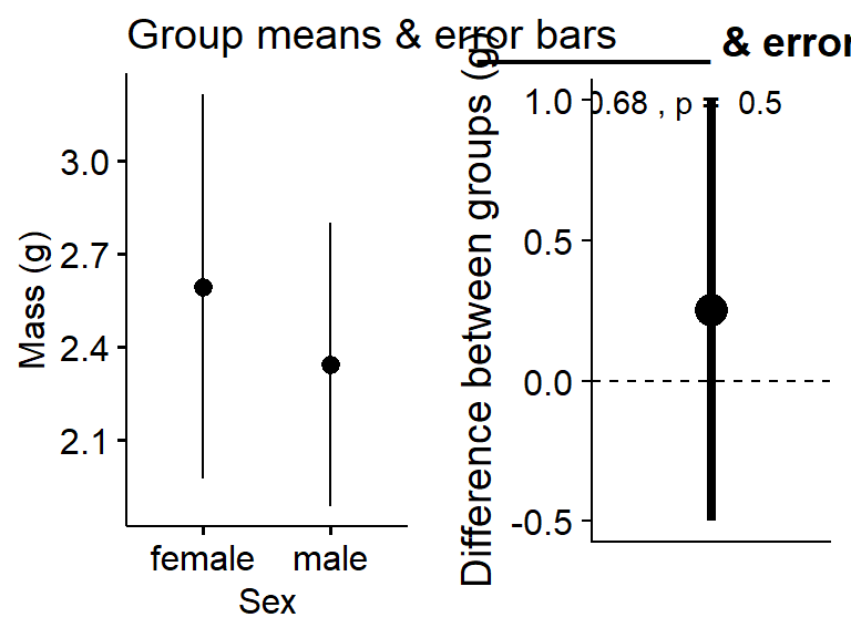
Did anyone get a significant result?
19.0.4 Arm girth
(do same thing for arm girth. see the super significant values?)
Now we are going to unpack this
19.0.5 Optional
This section is optional
There is a major flaw in this analysis. consider the following graph where the mass is plotted on the x-axis and the arm girth is plotted on the y-axis. Does arm girth vary just because of sex, or because of sex and mass?
This is ANCOVA. Sometimes taught as an extension of ANOVA, or as a type of regression.
ggscatter(data = frogarms,
          y = "arm",
          x = "mass",
          color = "sex")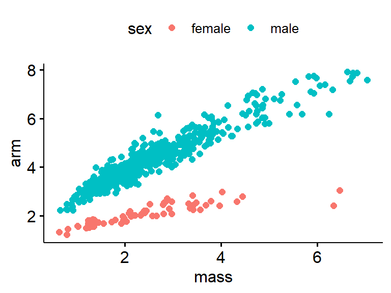
End optional section