18.4 Refining plots
Set colors
ggerrorplot(data = my.frogs,
          y = "mass",
          x = "sex",
          desc_stat = "mean_ci",
          color = "sex")         # color = ....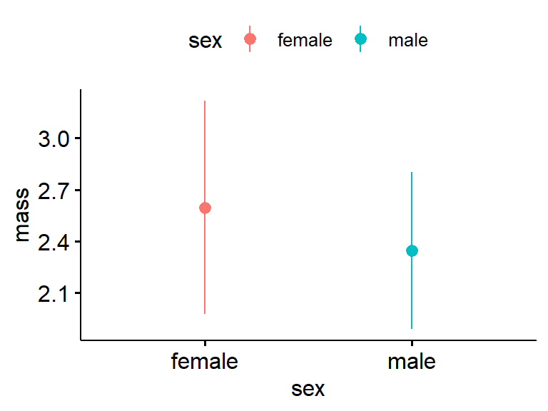
Add raw data. kinda crazy but worth seeing how it looks.
ggerrorplot(data = my.frogs,
          y = "mass",
          x = "sex",
          desc_stat = "mean_ci",
          color = "sex",
          shape = "sex",
          add = "point")  # add = "point"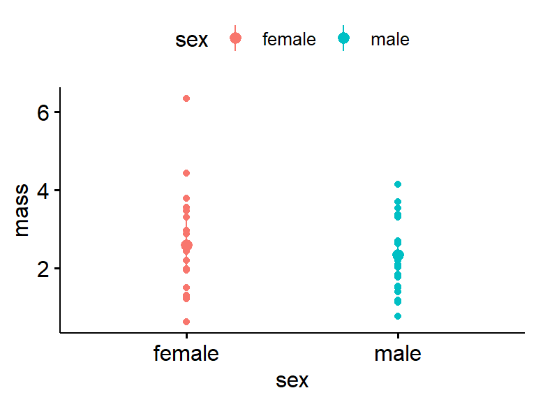
Jitter raw data. Even crazier. In general it works best if there are less than 10 data points per group.
ggerrorplot(data = my.frogs,
          y = "mass",
          x = "sex",
          desc_stat = "mean_ci",
          color = "sex",
          add = "jitter")        # add = "jitter"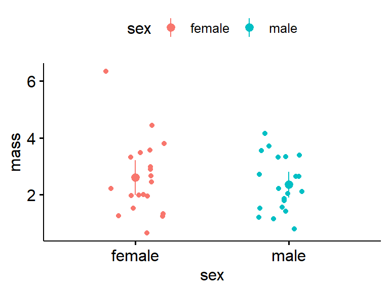
Change to the SD. In theory, about 2/3 of the data points should fall within +/- 1 SD. Does that look about right?
ggerrorplot(data = my.frogs,
          y = "mass",
          x = "sex",
          desc_stat = "mean_sd",  # desc_stat = "mean_sd"
          color = "sex",
          add = "jitter")
Back to the means and CIs, and increase size of the points.
ggerrorplot(data = my.frogs,
          y = "mass",
          x = "sex",
          desc_stat = "mean_ci",
          color = "sex",
          size = 1.5)           #increase point size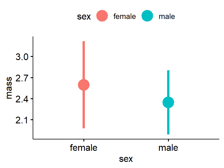
Move legend to the bottom using “legend =”bottom" “. Add some labels using xlab and ylab.
ggerrorplot(data = my.frogs,
          y = "mass",
          x = "sex",
          desc_stat = "mean_ci",
          color = "sex",
          size = 1.5,
          xlab = "Sex",
          ylab = "Mass (g)",
legend = "bottom") 