18.3 Representing variation with the SD
ggpubr has a very hand function for calcualting means and plotting error bars around them. ggerrorplot() (gg error plot) is the main function, and the “desc_stat = …” arguement defines what exactly to plot.
If for some reason you just want to plot means use “desc_stat = ‘mean’”, with mean quoted. 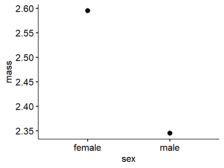
For the standard deviation use “desc_stat = ‘mean_sd’” (Note that any time you have a plot with errorbarrs – and if you plot means you should have error bars – you need to define at least in the figure legend what the error bars are.)
ggerrorplot(data = my.frogs,
            desc_stat = "mean_sd",
          y = "mass",
          x = "sex")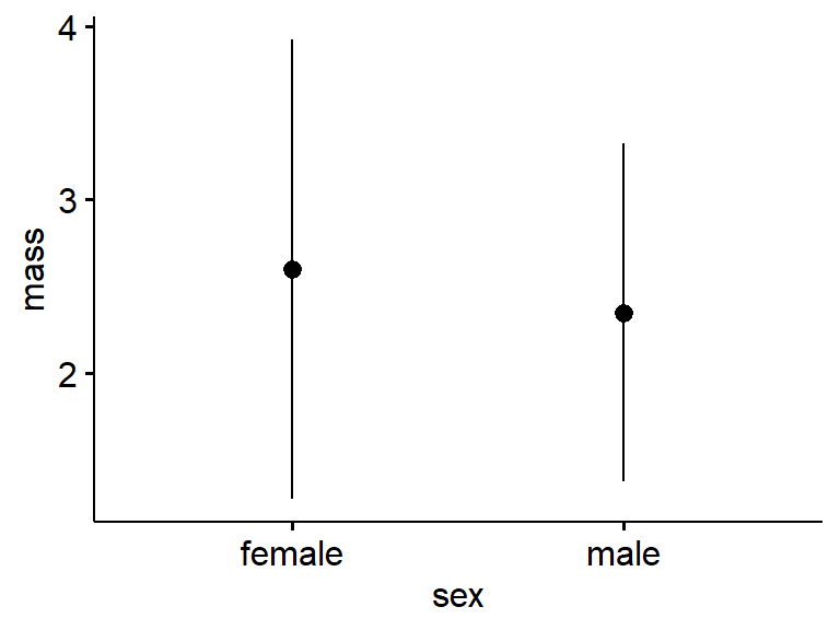
Again, the standard deviation is a measure of variation.
18.3.1 Representing precision with the SE
ggerrorplot() actually defaults to making a plot of the mean +/- 1 standard error (SE).
ggerrorplot(data = my.frogs,
          y = "mass",
          x = "sex")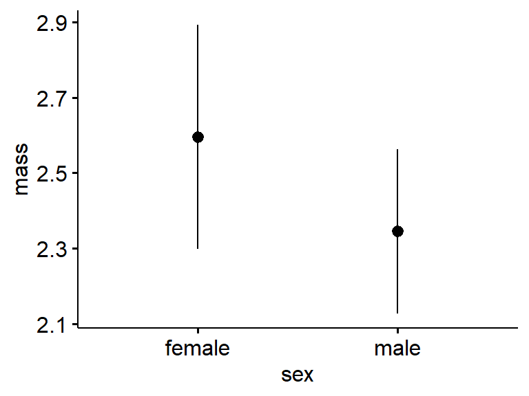
The means and 95% confidence interval are plotted with “desc_stat = ‘mean_ci’”
ggerrorplot(data = my.frogs,
          y = "mass",
          x = "sex",
          desc_stat = "mean_ci")
Again, the SE and 95% CI are measure of precision. There can be lots of variation in a dataset (SD is high) but if you have collected a lot of data (N is arge), you should be able to estimate the mean with precision. In general, the more data you have, the more precise your estimate will be.
You can see how more data increases precision by comparing the entire frogarms dataset against your personal subset. We can assign each plot to an object using the assignment operator “<-” and then plot them side by side with plot_grid() from cowplot.
#your data
gg.my.frogs <- ggerrorplot(data = my.frogs,
          y = "mass",
          x = "sex",
          desc_stat = "mean_ci",
          ylim = c(1.25,3.75))

#all of the forgm data
gg.all.frogs <- ggerrorplot(data = frogarms, #changed data = ...
          y = "mass",
          x = "sex",
          desc_stat = "mean_ci",
          ylim = c(1.25,3.75))
Now plot them together using cowplot::plot_grid(). Then means will be different because of random variation between the subsamples. What happens to the error bars?.
plot_grid(gg.my.frogs,
          gg.all.frogs,
          labels = c("my frogs","all frogs"))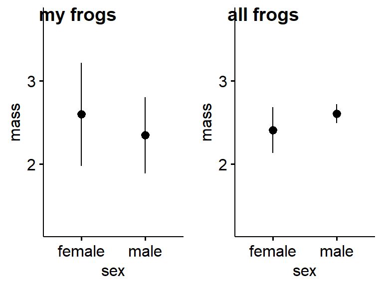
Now, what if instead of the 95% CI we plotted the SD? What do you think that will look like? Adapt the code from above by changing “desc_stat = ‘mean_ci’” to “desc_stat = ‘mean_sd’”.