17.2 Data exploration plots
We’ll make some plots to look at the overall structure and distribution of the data. After first looking at a Cleveland dotplot, we’ll focus on boxplots but also consider some others, including violin plots.
17.2.1 Cleveland dot plot
A useful tool for looking at your data is a Clevand dot plot. This is just the variable you are interested in (eg mass) plotted against its rank in the data set or some other organization scheme. This allows you to quickly spot an values that are really weird, such as typos.
ggdotchart(data = my.frogs,
           x= "i.row",
           y = "mass",
           rotate = T)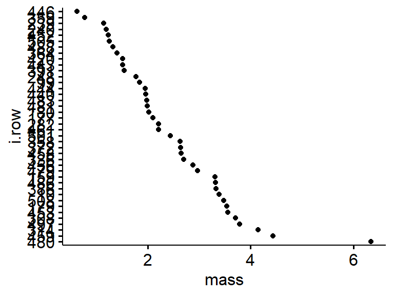
For more on Cleveland dotplots and data exploraiton see
Zuur et al 2010. A protocol for data exploration to avoid common statistical problems. Methods in E&E. https://besjournals.onlinelibrary.wiley.com/doi/full/10.1111/j.2041-210X.2009.00001.x
17.2.2 Boxplots
Basic boxplots are easy to make with ggpubr’s ggboxplot() function. Note that “mass” and “sex” are in quotes.
ggboxplot(data = my.frogs, # the data frame
          y = "mass",      # y-axis: a continous variable; in quotes!
          x = "sex")       # x-axis: a group; in quotes!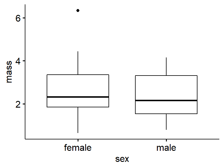
17.2.3 Notched boxplot
We’ll use the original frogarms dataframe first for this. These aren’t commonly used; the notches work kind of like confidence intervals to determine if medians are different.
ggboxplot(data = frogarms, #full dataset
          y = "mass",
          x = "sex",
notch = TRUE) 
Now try your own subset of the data. The Notch calculations likely get messed up with small samples sizes. R will likely give you several warnings in red.
ggboxplot(data = my.frogs, #my subset
          y = "mass",
          x = "sex",
          notch  = TRUE)
17.2.4 Filled boxplots
Its good practice to accent plot elements that relate to different groups. ggplot and ggpubr make this really eas. We can add colored fill to the box plots using fill = “…”; note that it is “fill” not “color”. (Color changes the color of the lines).
ggboxplot(data = my.frogs,
          y = "mass",      # quotes!
          x = "sex",
          notch  = TRUE,
          fill = "sex")
We can turn off the notching by adding a “#” character before it. This is called commenting out that line of code
ggboxplot(data = my.frogs,
          y = "mass",
          x = "sex",
          #notch  = TRUE,
          fill = "sex")
17.2.5 Boxplots with raw data
Its best to plot your raw data whenever possible. This works best with small datasets. We’ll do this by appending add = “point”.
ggboxplot(data = my.frogs,
          y = "mass",
          x = "sex",
          #notch  = TRUE,
          fill = "sex",
          add = "point")   # add = "point", with quotes!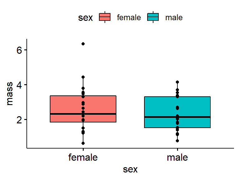
For more best practices in plotting data see
- Weissgerber et al. 2017. Data visualization, bar naked: A free tool for creating interactive graphics. Journal of Biological Chemistry. http://www.jbc.org/content/292/50/20592.full
- Weissgerber et al. 2015. Beyond bar and line graphs: time for a new data presentation paradigm. PLoS. https://journals.plos.org/plosbiology/article?id=10.1371/journal.pbio.1002128&fullSite
17.2.6 Boxplots with jittered raw data
This can be helpful, though ggpubr::ggboxplot doesn’t allow much control over the jittering. Jittering is helpful when you have large datasets and want to avoid overlap in the points. We’ll append add = “jitter”.
ggboxplot(data = my.frogs,
          y = "mass",
          x = "sex",
          fill = "sex",
          add = "jitter") # add = "jitter"
17.2.7 OPTIONAL: Jittering with ggplot2 [O]
The following section is opptional
ggpubr helps simplify ggplot2 code, but in doing so adds some constraints. You can combine ggpubr commands with regular ggplot2 code though. We’ll use the code we did above and also add “+ geom_jitter()”
This code should produce a plot similar to the one above. Note that after " fill = “sex”) " there is a “+”, ( eg, " fill = “sex”) + " ) and that on the next line is " geom_jitter()"
ggboxplot(data = my.frogs,
          y = "mass",
          x = "sex",
          fill = "sex") +  # need the plus!
  geom_jitter()            # the jitter command
We can make the jittering less extreme by adding “width = 0.1” within geom_jitter()
ggboxplot(data = my.frogs,
          y = "mass",
          x = "sex",
          fill = "sex") +  #need the plus!
  geom_jitter(width = 0.1) #reduce the magnitude of the jitter
End optional section
17.2.8 Label ggpubr axes
A graph isn’t done until it has labels. This can get annoying in base R (eg plot()) graphics and ggplot2, but is easy in ggpubr.
17.2.8.1 Adding Axes lables
Adding the arguements “xlab = …” and “ylab = …” adds axes labels. Always add units (eg “g” for grams) when applicable.
ggboxplot(data = my.frogs,
          y = "mass",
          x = "sex",
          fill = "sex",
          xlab = "Sex",      #x axis (horizontal); quotes!
          ylab = "Mass (g)") #y axis (vertical)
17.2.8.2 Plot title
The command “main = …” adds a main title at the top of the graph. This is not usually done for publications but useful for keeping track of things and for presentations.
ggboxplot(data = my.frogs,
          y = "mass",
          x = "sex",
          fill = "sex",
          add = "jitter",
          xlab = "Sex",
          ylab = "Mass (g)",
          main = "Mass of Australian frogs by sex") #Main title
17.2.8.3 Refining ggpubr plots
Move the legend to the bottom using legend = “bottom”.
ggboxplot(data = my.frogs,
          y = "mass",
          x = "sex",
          fill = "sex",
          xlab = "Sex",
          ylab = "Mass (g)",
          main = "Mass of frogs by sex", # main title
          legend = "bottom")             # location of legend
Change the color palette; Note that the colors are within c(…).
ggboxplot(data = my.frogs,
          y = "mass",
          x = "sex",
          fill = "sex",
          xlab = "Sex",
          ylab = "Mass (g)",
          main = "Mass of frogs by sex",
          legend = "bottom",
          palette = c("green","blue"))  # change pallete
17.2.9 Plotting multple plots with cowplot::plot_grid
You can save just about anything as an R object, and we can save a plot to an R object. I will use the assignment operation (<-) to assign the output of ggboxplot() to an object called “gg.my.frogs”. Note that here I am using my.frogs.
gg.my.frogs <- ggboxplot(data = my.frogs,
          y = "mass",
          x = "sex")
Note that the code runs but nothing happens…
We can see what we just made using is()
is(gg.my.frogs)This indicates 1) gg.my.frogs is there and 2) it is a “gg” type R object.
I can get the graph if I call just the object gg.my.frogs (eg, just type “gg.my.frogs” into the console and press enter, or highlight just the word “gg.my.frogs” in a script and execute the command)
gg.my.frogs
Now, Make an object using the full frogarms data
gg.frogarms <- ggboxplot(data = frogarms, #use original data
          y = "mass",
          x = "sex")
Now plot both using the plot_grid() function from the handy cowplot package.
plot_grid(gg.my.frogs,
          gg.frogarms)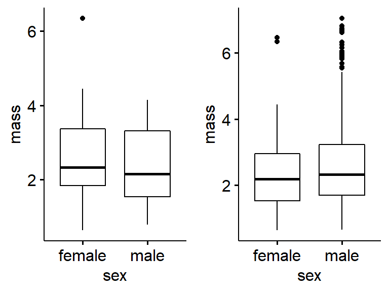
Add labels. Note that alignment is off sometimes.
plot_grid(gg.my.frogs,
          gg.frogarms,
          labels = c("a)My fogs","b)All the frogs"))
17.2.10 Violin plots
An interesting alternative to boxplot that works well with large data is the violin plot
ggviolin(data = frogarms, #use original data
          y = "mass",
          x = "sex")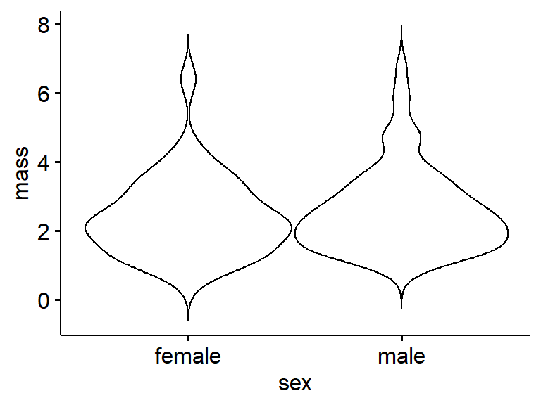
17.2.11 Optional: Histograms [0]
The following is optional
Histograms are excellent for data exploration. They generally work best with medium to large datasets.
A basic histogram can be made using gghistogram(). Note that there is “x = …” but no “y = …”; the y-axis is computed by the graphing function.
gghistogram(data = my.frogs,
            x = "mass")
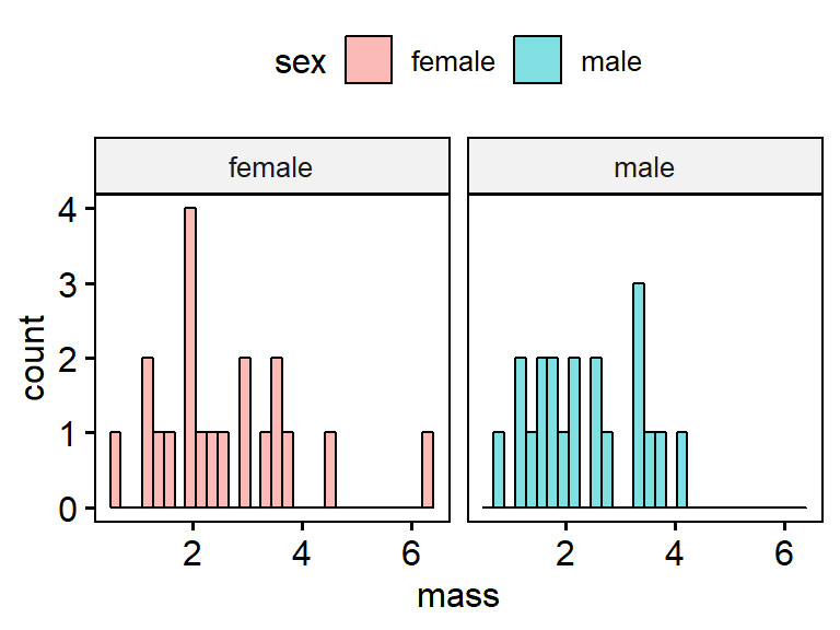
A key concept for ggplot is faceting. Faceting occurring when a two panels of plots are made from a single dataset, and the panels are split by a categorical variable. We can add the arguement “facet.by.by = sex” to make 2 panels, one for female and one for male. Note that because there are only 10 frogs in each group, the graphs aren’t very useful.
gghistogram(data = my.frogs,
            x = "mass",
            facet.by = "sex")
Just as we did for histograms we can change the fill, add a title, etc.